Get Started
Build faster with premium TailwindCSS + Next.js templates. Getting started is quick and easy. Follow the steps below to browse, purchase, and download top-notch UI components and templates crafted for modern web development.
Browse Templates & Components
Explore our curated library of professionally designed TailwindCSS + Next.js components and templates.


Pro Tip: Use filters to find exactly what you need—whether it's a landing page, dashboard, or UI block.
Purchase Using Razorpay
Click “Buy for $XX” on any product. A secure Razorpay modal will open where you can choose your preferred payment method (UPI, card, netbanking, etc.).
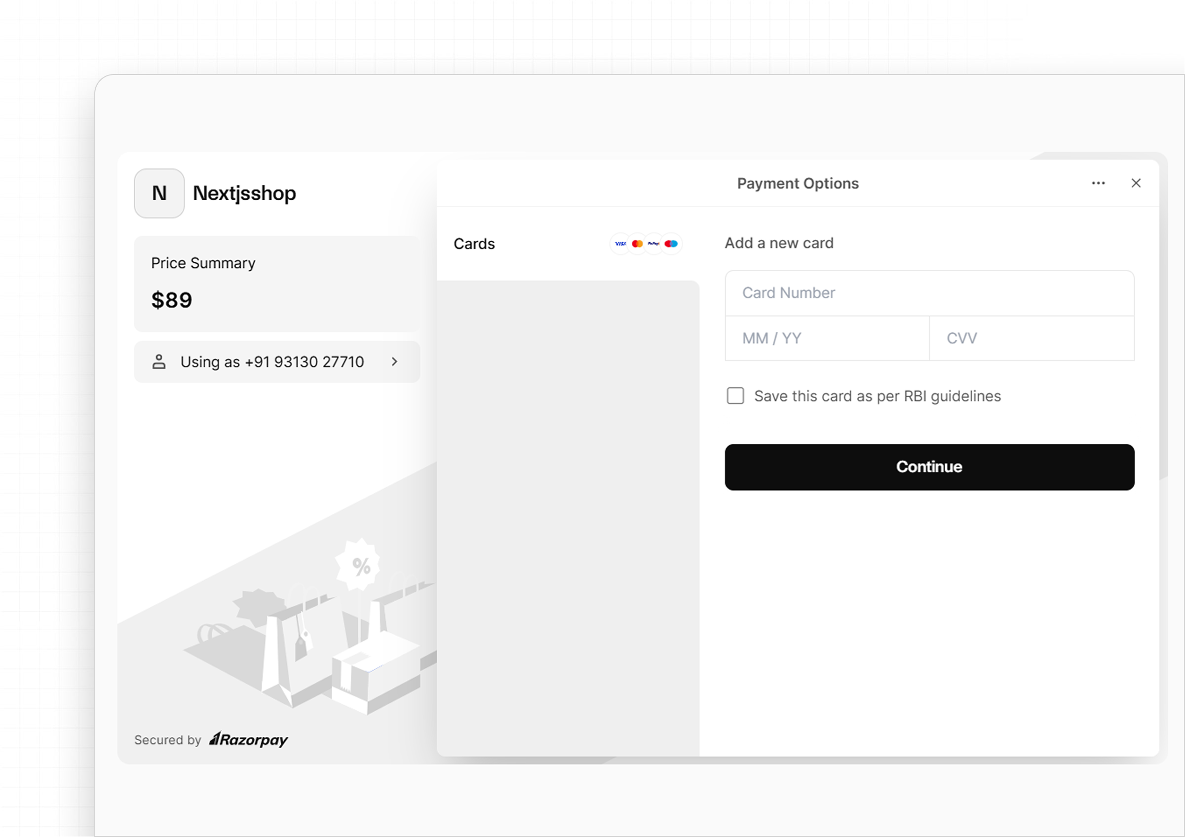
Secure & Fast: Payments are 100% secure and processed instantly.
Download Your Files
After successful payment, the Buy button changes to a Download button.
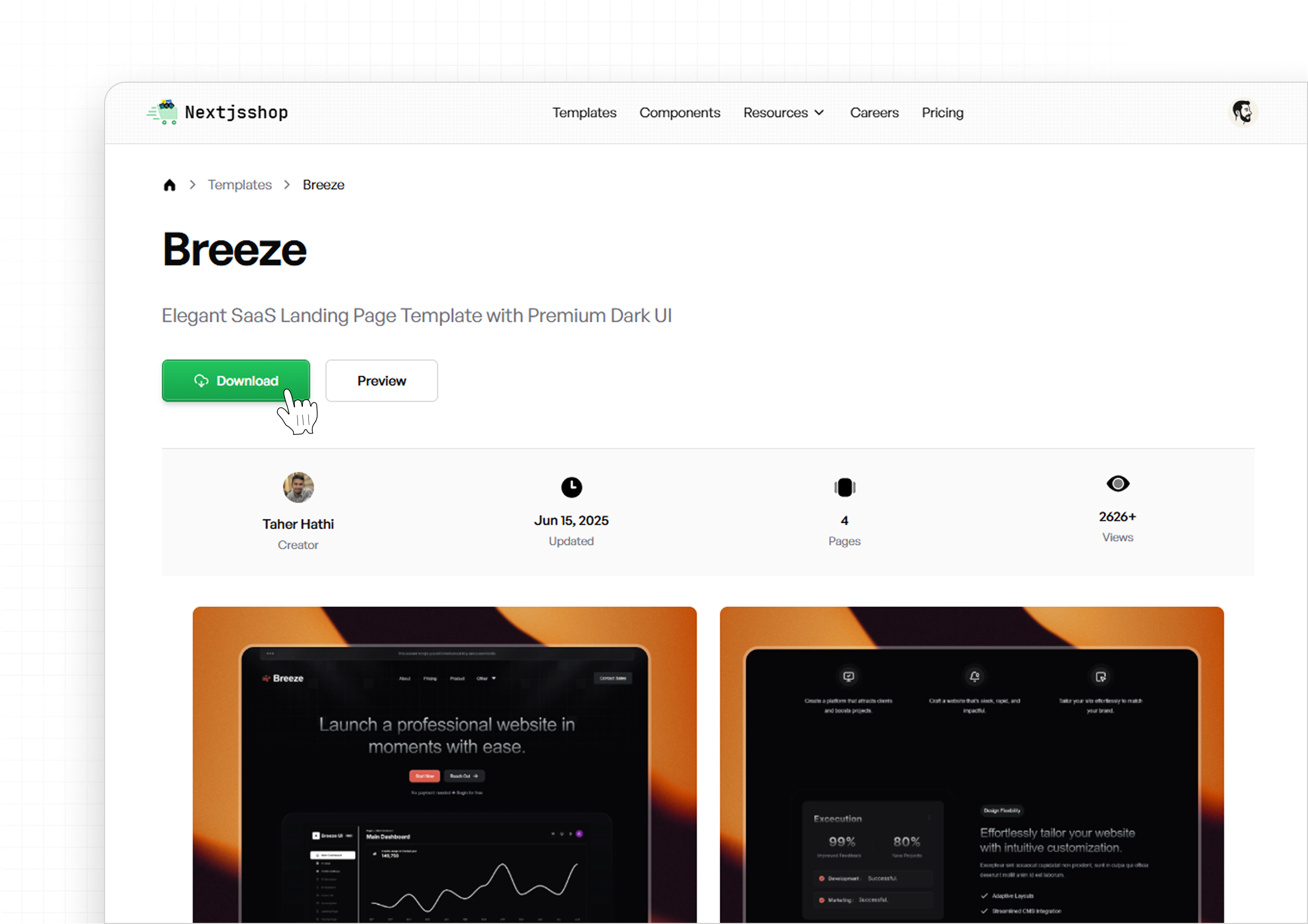

Click it, and your ZIP file with the full codebase of your component/template will be downloaded.
Start Building
Import the components into your Next.js project and start building stunning UIs in minutes. Every purchase includes clean, production-ready code.

What's Included in the Download?
- Fully responsive TailwindCSS code
- Next.js compatible structure
- Cleanly organized folders
- Easy customization
- License file
Folder Structure
A clean and scalable folder structure built on Next.js App Router and TailwindCSS.
Project Layout Overview
/
├── app/                  → All route files (App Router based)
│   ├── login/            → Auth route (Login form)
│   ├── signup/           → Auth route (Signup form)
│   └── page.tsx          → Homepage
│
├── components/           → Core UI components (Header, Hero, Footer, etc.)
├── components/ui/        → ShadCN UI components (if used)
├── lib/                  → Utility functions (e.g., form validation)
├── hooks/                → Custom React hooks
├── public/               → Static assets (images, icons, etc.)
├── styles/               → TailwindCSS global styles
├── types/                → Shared TypeScript definitions
├── figma/                → Figma design file(s)
├── tailwind.config.ts    → Tailwind configuration
└── package.json
Highlights
- App Router Ready: Built using the latest Next.js routing system.
- Modular Components: Organized for reusability and clean structure.
- ShadCN Integration: UI components live in
components/uiwhen used. - Typed & Scalable: Includes TypeScript, hooks, and utility separation.
Auth Pages Boilerplate
Both /login and /signup routes come pre-configured with:
- React Hook Form – Clean, performant form logic
- Zod – Schema-based validation
- TanStack Query – Async form handling
- React Hot Toast – Feedback notifications
Figma Included
The figma/ folder includes:
- Desktop & mobile screens
- Color, type, and spacing tokens
- Reusable components and UI kit
Ready for Production
Structured for scalable development and easy deployment:
- Clean file organization & naming
- Tailwind + PostCSS configured out-of-the-box
- Deploy instantly with Vercel or Netlify
Design Files
A Figma file is available for each template. However, since our primary focus is on providing quality code for developers, the design files serve solely as a visual reference and are not organized into complex auto layouts or dynamic components. You can download a free Figma file from our public page to see how our design files are structured.