Changelog
Changelog
New updates
and improvements
December 15, 2025
v2.4.0 – Command Palette for Faster Navigation
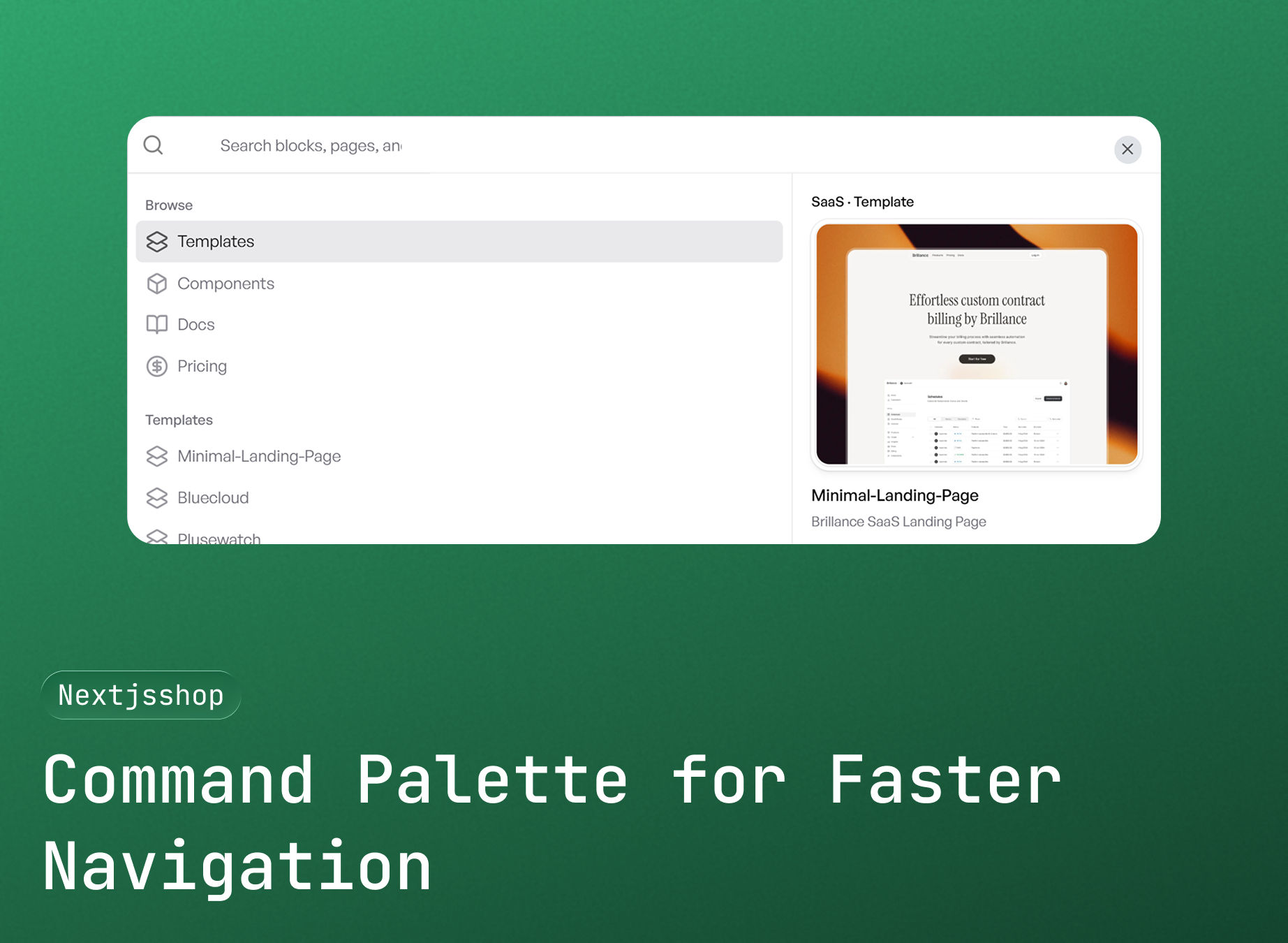
Navigate components and templates instantly with the new command palette.
We’ve added a global command palette that lets you quickly search and jump to any component or template from anywhere on the site—no more digging through menus.
What’s new:
•Global command palette for instant navigation
•Search across components and templates in one place
•Keyboard-first experience for faster workflows
•Quick access from anywhere on the site
•Designed for speed and developer productivity
This update makes exploring Nextjsshop faster and more intuitive, especially as the library continues to grow.

Decemeber 10, 2025
v2.3.0 – Live Preview for All Components

You can now preview all components live before using them.
We’ve introduced a dedicated preview route that lets you explore every component in action, making it easier to evaluate layouts, interactions, and responsiveness in real time.
What’s new:
•Live preview for all components in one place
•Real-time rendering with accurate spacing and styles
•Responsive previews across different screen sizes
•No setup or installation required
•Faster decision-making before copy-paste
This update helps you confidently choose the right component by seeing exactly how it looks and behaves before integrating it into your project.
December 1, 2025
v2.2.0 – 15 New Pro Components Added

We’ve expanded the Pro component library with 15 brand-new, production-ready components designed to speed up real-world UI development.
What’s new:
•15 premium UI components added to the Pro library
•Clean, modern layouts optimized for SaaS and startup products
•Fully responsive and mobile-friendly designs
•Built with TypeScript and Tailwind CSS
•Easy copy-paste integration with shadcn/ui projects
Highlights:
•Advanced footers, pricing sections, and layout blocks
•Focus on accessibility, spacing, and visual consistency
•Drop-in components ready for production use
•Consistent API and styling across all new components
All new components are available now for Pro users on the Components page.
September 20, 2025
v2.1.0 - Bundle Purchases & Enhanced Pricing
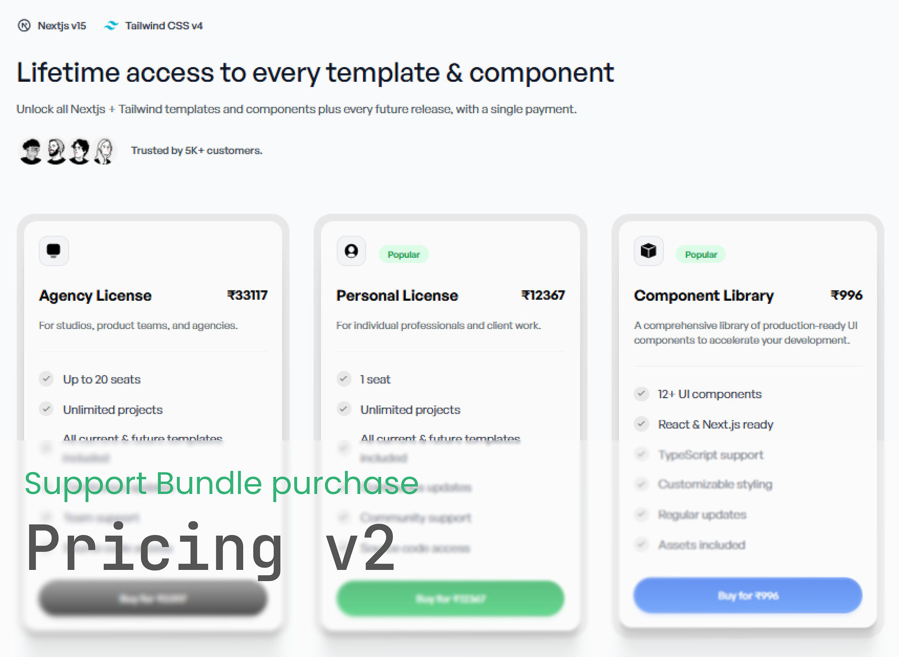
Introducing comprehensive bundle purchasing options and streamlined payment experience.
New Features:
•Agency License Bundle: Complete access to all templates and components for teams
•Personal License Bundle: Individual access to all current and future templates
•Component Library Bundle: Dedicated access to our growing component collection
•Razorpay Integration: Seamless payment processing with multiple currency support
•License Management: Automatic access to new items for existing license holders
Payment & UX Improvements:
•Real-time payment verification with loading indicators
•"Already Purchased" status for existing license holders
•Processing states to prevent duplicate purchases
•Enhanced error handling and user feedback
•Support for INR and USD currencies
This update makes it easier than ever to get comprehensive access to our entire library with just one purchase.
July 18, 2025
v1.0.0 - Initial Release
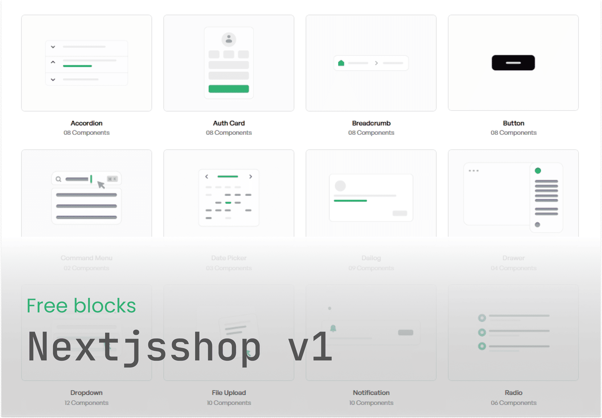
This release unlocks and publishes all free UI blocks for public access.
Key highlights include:
•Access to a growing library of professionally designed free blocks
•Components optimized for responsiveness and performance
•Copy-paste ready code for faster development workflows
•Support for Tailwind CSS and modern design standards
Developer experience improvements:
•Enhanced folder structure for easier block discovery
•Consistent naming and formatting across all blocks
•Live preview support for faster iteration
No breaking changes in this release.
